Sunday, 17 June 2012

Project 6 : Minut Init Studio Galleria

Title : Minut Init Studio Galleria

Description :
Minut Init derived from the British slang, 'Minut Aint It?' which perfectly describes the art space which was originally a small office in the vibrant area of Uptown Damansara, where predominantly famous for its variety of food hawkers.It is a small place for art to be presented in its true nature of the artist's choice and make use of every little space in oppose to the obligatory empty spaces of general art galleries. The gallery itself is seen as a canvas for the curators and artists to decorate as they see fit. It is an unique space where the audience are made comfortable in order to have an easier understanding of the arts instead of the traditional galleries where the overwhelming arts often creates a sense of social detachment and barrier.


Objective (What am i trying to do) :
The purpose of the establishment is to build a platform where Malaysian-based Artists are able to express their artistic values and works without the discrimination of censorhips. It is also intended to become a melting pot of all aspect and range of artworks from various artistic perspective and lifestyle.
In addition, the institution wishes to shed light onto the neglected underground art scene and build a respectable reputation for the artistes that have been undervalued. Thus also educating the public on the hidden treasures of the local talents. Furthermore, the gallery is intended as a haven for novelty seekers and social interactions of an alternative lifestyle. Overall, Minut Init aims to change and revolutionize the local art industry and the perspective of the public towards artists in general.


Technics and method :
The techniques and methods used in order for this project of a Studio Galleria to succeed is the balance of  marketing, curating and interior designing.

In the aspect of interior designing of the art space the techniques used are often in constant changing of the placement of the contents.

- Furniture and lightnings would be perfectly placed according to the arrangement of the artworks and would vary from time to time.
- The artworks in the gallery would be showcased in the style chosen by the artist and cover the entire space in a proper placement that suits the theme of the exhibition.
- An appropriate arrangement of the arts are highly prioritize to ensure the correct blending and emphasizing of the works.


Meanwhile the aspect of curating an exhibition :
- Proper care and storage of the artworks are a main concern to avoid damages to the artwork.
- The display of the artworks are often seen as a form of collage itself.
- Exhibitions that varies from all type of arts would be planned and executed.
 - Examples of our previous exhibitions :


     * Minut Init : An exhibition that showcase a variety of paintings, prints and photography 
     * Kukubesi : A mystical exhibition of weaponry and props
     * Tinpix :  An exhibition of mobile photography
     * Tahi Cicak : A black and white film photography exhibition
     * Creole : An exhibition that celebrates the foreign influences on local art
- We also engage in charity and community events such as :
   * Arts for Grab - Human Rights Day
   * Baht 19 Charity Auction 2012


In addition, the necessary methods taken in aspect of marketing is the wide coverage of media exposure. Using contacts gathered from previous social engagements we set up interviews to promote and expose the gallery and the events from all range of medias such as :
- Radio talk shows ; BFM
- Magazines : Esquire, Juice (Art Gallery of 2011)
- Television channel : 8tv Quickie
- Newspaper : The Stars
- Internet : Facebook, Blogspot, Tumblr, Art Radar Asia Journal, Twitter


Research on similiar:
For this project the similar galleries that i have researched on are :

1) Art Village : G13 Gallery (Malaysia)
   - It is one of the local art gallery which has been establishment by the TengArt Illustration company  back in 2005.
- Its one of the new art galleries which is located in a unique space of an office building in Kelana Square, Kelana Jaya, an area which is similar to Uptown Damansara and not a usual place for an art gallery
-The location and the space of the gallery is though wider than Minut Init but displays its artworks in a quite similar fashion with the exception of an obligatory empty spaces in between 
- It has been exhibiting many renowned local artists as well as upcoming talents with supports from the well known art communities
- Unlike Minut Init, this gallery has the financial endorsements from private and government companies which has enable them to execute bigger projects
- Though the marketing and exposure of the gallery is focused only on the elite few of art enthusiast and big name art collectors
- It is stated that their mission is to nurture the local art scene and have done efforts of charity events and workshop for the public, nevertheless it still constrict itself to the standards of censorship and acceptability of the more general art and neglected the street artist.
- It is also rumored like many other art galleries in Malaysia to mistreated the artist by taking a higher percentage of the art sales

2)Backwood Gallery (Melbourne)
- Founded in 2010 by Alexander Mitchell, this gallery has become the prime destination for Australian and International Street Art enthusiast and artist alike.
- The main mission of the gallery is to build a bridge in the gap between street art and the gallery wall while retaining the authentic vision and philosophy of the artist.
- It has participating artist such as Mark Bode, TwoOne, RONE, Toshikazu Nozaka and many more prestige artistes.
-  It is an art gallery that celebrates and supports the street arts without any discrimination or censorship and thus being the perfect role model for Minut Init.


Philosophy and theories:
- The philosophy used when setting up the gallery was a rebellious notion against the society and authorities tendency to cover up the truth of the art and thus limiting the freedom of speech in Malaysia.

- Our ideology is to ensure the survival of expression without boundaries which has always been the essence of Arts and could be traced back in history to the Athenian philosopher, Socrates.

- As Victor Hugo once said  “Freedom in art, freedom in society, this is the double goal towards which all consistent and logical minds must strive.”

- At Minut Init, we believe that art should not be constricted to the manner which the authorities see fit and should be a form of expression of the truth from the artist perspective. Thus only the artist should control the delivery of the content. 

- We also believe that Art should not be a distant and alien window of a reality which the audience would have a hard time relating to but instead Art should be positioned in a comfortable manner that enables the audience to glimpse into the artist's perspective with ease.


Referencing :
Art Village - G13 Gallery: http://www.artvillage.com.my/
 Backwood Gallery :         http://backwoodsgallery.com/


Evaluation :
- In conclusion, Minut Init Studio Galleria is in the right track of achieving its goal.
- Though we are still young and respectively small in comparison of other international galleries, I am proud to see how a simple idea with low financial support and funding has escalate itself to becoming a beacon the young artists in Malaysia.
- There would no doubt plenty more things to execute in order to fully succeed in changing the local art scene, nevertheless the guys behind the gallery are young and hungry to strive achievements.  

Project 5 : Collage Canvas of Beauty


Title :   Collage Canvas of Beauty


Description

  • A collection of selected artworks are compile to create a collage.
  • Drawings and Painting of the female figures are made on canvases of a different sizes.
  • The content of the artworks focuses on the beauty and mystery of the female gender from their physical attraction, smiles that hides their personality and as well as metaphorical subjects such as a feline.
  • One of the canvas artwork contains a patterned design which holds a feminine touch.
  • Three of the works in this project was also used in the Project 3.
  • Some of the artworks are made on papers and paste on the canvas.


Objective (What am i trying to do) :

  • The purpose of the project is to exhibit the sexual attraction that lies in women.
  • To celebrate the properties of the feminine beauty.
  • To showcase the unique differences of female personalities that often hides beneath the expression of their faces
  • To reveal the relation between a few subjects of the content such as the cat and patterns with the female gender


Technics and method :
The techniques and methods used for this project is drawing  the content, pasting the loose mediums and creating a collage of the artworks.

  • Firstly the subjects of the project is drawn onto the medium such as papers and canvas using pen and marker.
  • I use the technique of drawing or sketching the content for it enable me to have a greater control of the outcome.
  • My refusal to use colors can also be seen as a metaphor for my quest to exhibit the true nature of female beauty without the distracting and coverings of colors that acts as a make up or fashions which hides their beauty.
  • I also used only black and white instead of full colors is to show that variety of the female personality can be seen even without the usage of colors.
  • Those materials that are drawn on papers are then stick onto the canvas using adhesive in the carefully selected position.


- The artworks then hang on the wall to create a collage that correspond with each other.
- I use the method of collage in this project is to show that even in the effort of debasing the female beauty to its natural disposition, the complexity of a woman's personality is to vast to be fully understood and thus only fragments of their true self is shown in this collection.
- This technique of creating a collage of the artworks, also can be used as a metaphor how woman often reveals themselves to their male counterparts. Even with glimpse of the female personality is shown to man, there is a wider world of female behavior that we will have a confusing time to understand.


Research on similiar:
For this project the similar galleries that i have researched on are :

1) ArnoBreker

  • Born in the Northern German city of Elberfeld, on July 19th, 1900.
  • Notoriously known for his connections with Adolf Hitler, he even travel together with the Fuhrer the occupied France
  • Well known for his traditional approach on the human anatomy that depicts the forms of both male and female in its highest glory
  • Though he is better known as a sculptor, his sketches of the female figure is uniquely beautiful in its details and thus a great guidance for this project


2) Frank Miller

  • Born in Olney, Maryland on January 27, 1957.
  • A well known graphic novel artist with adaptions of his works into big Hollywood movies such as Sin City and 300.
  • His style of drawing vary from work to work but it always contains the element of the comic book
  • His visual representation of the female body are often very seductive and mysterious which can be use as a reference to my style


Philosophy and theories:

  • The main philosophy that i wished to deliver in this project is the true nature of the complex beauty of  the female gender which are often obscure by the style of fashion and make ups that they wear and also their personalities which hides behind their smiles and expression.
  • I also wish to show how woman only shows segmented portion and hides the bigger picture from their counterpart.
  • In addition, the project also portrays how the physical beauty attracts man and distract us from understanding woman in a great depth.
  • Furthermore, subjects in the collage such as the cat and the pattern is to show how the slang or term of 'pussy' often relates to female in the modern culture and how the intricate design shows acts as an abstract representation of the women nature.


Referencing :

1) ArnoBreker :
-http://www.hitler.org/art/breker/
-http://figure-drawings.blogspot.com/2011/02/arno-breker-female-drawings.html

 2) Frank Miller  :
http://moebiusgraphics.com/miller.php 


Evaluation :

  • In conclusion, this project is my effort in trying to understand female beauty in its true nature while showcasing the distracting attraction of their seductive body.
  • The project also exhibits  the woman's tendency to be secretive by giving teasing glimpse of their personality.
  • Overall, this project shows the my perspective of woman beauty and the obsession of male towards female while depicting the relationship between the two sexes with the audience being the male counterpart.


Project 4 : Sketches Enlargement


Title : Sketches Enlargement


Description :

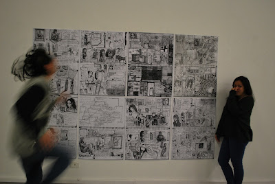
  •  A collection of selected pages from my sketch book which has been enlarged and printed onto A1 Size papers.
  • The content of the pages consist of a mixture of comic book and collage style sketches
  • The pages is then pasted in a neat collage manner.


Objective (What I'm trying to do) :
- To showcase the content of the sketches in an easy viewing manner
- To bring sketches to a street art display
- To study the response of the audience and inquire the likeability of the sketches to be displayed in public walls


Techniques : Imprinting and enlarging selected artworks from the pages of my sketch book. The methods used are sketching in the mixture style of comic book and collage, enlarging and printing the works, and displaying them in a collage manner.

Sketching :
- The sketching technique is used to ensure the proper content is deliver.
- The sketching was done using marker and pen.
- Sketching is one of the most common and easy methods for artists to use.
- The pages of the sketchbook is filled and uses every empty spaces with materials.
- The content are purely based on the imagery of my mind with influences of medias through out my daily life.
- The style used in sketching is a combination of collage and comic book which can be seen with the content being fragments of subjects which is drawn in a graphic novel layouts.

Printing :
- The method of printing is used on reproducing the sketches in order to ensure the quality and details of the artworks when it is enlarged.

Collage :
-The technique of college is used in this project to display the selected sketches because it is a reflection of the style of the pages.
- In the pages of the sketchbook the style of collage is mixed with comic book essence to ensure every empty spaces are utilize
- Thus the display of the enlarged selected works is also exhibit in a collage manner to show the amplification of the pages itself.
- In retrospective, the wall where the collection of the works are exhibited is a page itself which is design in the same manner of the contents.


Research on similiar:
For this project the similar artist that i have researched on are :

1) Hope Gangloff
- Born on 1974 in Amityville, New York.
- His first recorded exhibition was in 2001, where he collaborated with Jason Search and City Arts to create a temporary installation of a mural entitled 'Forever Tall' on 6th & Bowery, New York.
- His drawings holds a close resemblance with my sketches with the exception that his works are colored while mine remains in the state of black and white.
-  The background of works display an aspect of collage style with a sense of misplacement.
- The character designs are often in two dimensional layer which hold a semi-realistic properties.
- One of the big differences one can state between his works and mine is that his works has the style of a Indie Pop Rock culture while mine consist of a Gothic Punk Rock culture and influences of MAUS.
- Thus with a high similarities in the artworks, I often uses his arts as a reference and guidance in my own sketches.


2) MAUS by Art Spiegelman 
- Maus is a graphic novel created by the american cartoonist Art spiegelman which depicts his experiences as a Polish Jew in the Holocaust of the World War 2.
- The style of the drawings of the characters shows a dark and more matured cartoon which plays with the structure and shadings of the content to bring a unique blend of comic
- The style and skills used by Art Spiegelman in the graphic novel Maus, is a primary influence in the sketching techniques of my contents.


Philosophy and Theory :
The main philosophy that i wish to deliver in this project is the appreciation of the tiny things in life and as well as the smallest details in art. This is the main agenda behind enlarging the sketches to give the audience a better view of the easily overlook details while maintaining them in their natural state with the overwhelming contents of the collage.

Secondly, the ideology behind this project was also to depict sketches in the style of street arts even though I only displayed my artworks in the gallery, it was my intention to further develop this concept and bring it to the streets with perhaps a bigger enlargement of the sketches.


Referencing :

1) Hope Gangloff :
-http://inglettgallery.com/admin/bio_pdfs/718.pdf
-http://www.hopegangloff.com/drawings.html

2)MAUS by Art Spiegelman : - http://www2.iath.virginia.edu/holocaust/spiegelman.html
                                            - http://www.jewishvirtuallibrary.org/jsource/biography/Spiegelman.html


Evaluation :
- In conclusion, this project of Sketch Enlargement is to appreciate the small details in art while retaining its true nature of vague blending into a collage of materials. There are plenty of options to set forth from this point with adding colors or even a single sketch enlargement to a size of a wall.

This project also holds aspects of the objective and vision from both Project 1 : The Contrivance of Subliminal Distraction and Project 3 : The Aesthetic Rambling.

The aspect of project 1 that we could see in this project is the idea of subliminal content except that in this project, i wish to celebrate and showcase the subliminal content in a bigger display.

The aspect of project 3 that influences in this project is the intention of showcasing these materials on the streets and perhaps even in the same style and technique of project 3. Though, this project remains indoor for now, i do wish to further continue this idea.


Project 3 : The Aesthetic Rambling


Title :The Aesthetic Rambling

Description :

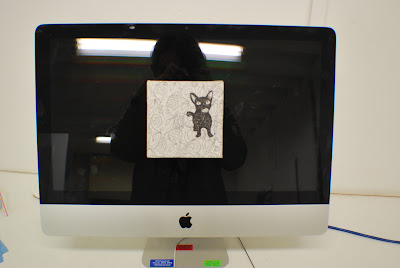
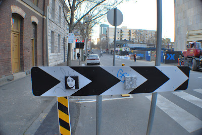
  • Three artworks were created using acrylic paint and pen with the content of  a Curious Cat, A Hidden Emotion Girl and A College of Female
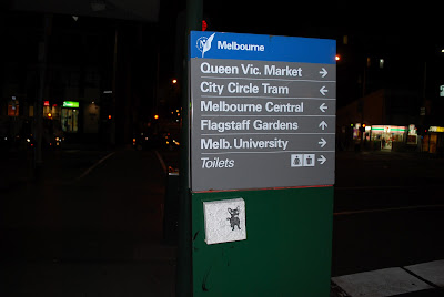
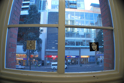
  • These Three canvas of 30cmX30cm in size are then brought outside to the public where they are placed at specific location for a certain amount of time before traveling to another chosen spots that would either emphasize the paintings or blend it into the its surroundings.


Objective (What I'm trying to do) :

  • The main objective of this project is to bridge the gap between street art and the gallery but in a reverse method. Instead of taking the street art to the galleries, i brought the paintings which  often belong in the galleries to the streets.
  • The objective of project is also to bring these paintings to the public and bring simple object or signs a different meaning and perspective.
  • In addition, the project aim to see these paintings in a different environment which would bring various perception and context toward the artworks.


Techniques :
The techniques and methods used in this project are firstly drawings and paintings on the canvases using acrylic paint and pen.

The method used for the journey of the painting on the streets has not been give a specific name but the details are simple.
- Finding a perfect spot of choice which would correspond perfectly with the paintings and sticking it there using any temporary adhesive.

  • Let the artwork remain at that spot for a short period of time. Usually during this period I would snap some pictures of it, thus creating a sense of curiosity in the public to explore the artwork and admire it.
  • This creates a sense of uniqueness in that moment for the audience for that exact absorption of the creativity would be rare to duplicate even thought there is a photograph to share the experience.
  • Remove the artwork and continue to a new destination. And begin the process all over again.
  • With the details of this method we could suggest naming it, 'Rambling' for the artwork is always wandering around.


Research on similiar:
For this project the similar artist that i have researched on are :

1) Invader

  • born in 1969, he is a French urban artist who was become well known for pasting up mosaic tiles in a pattern to form characters from the 1978 arcade game Space Invader thus the origin of his pseudonym.
  • Like many street artist his secret identity is to protect him from the law.
  • His artwork are the most similar style to mine with the exception that his work are tiles and permanent to a single spot while mine are canvas and ever changing.
  • His work was the main inspiration in my method of this project.


2)Banksy

  • According to Tristan Manco, an author of Home Sweet Home, Banksy was born in 1974 and raised in Bristol, England, This England-based street artist adds a dark humor which often reflects on his political rebellion into his graffiti and stencils.
  • -Banksy is perhaps one of the most famous and influential street artist that has inspired young artist around the world and it is without a doubt a great contributor to my style and understanding of street arts.


3) Drewfunk

  •  A Malaysian born street artist who currently resides in Melbourne.
  • He is known as one of Malaysia's top street artist and has a high reputation internationally.
  • His artwork ranges from designs, murals, illustration and many more with unique and easy to love style.
  • Drewfunk is also an acquaintance of mine, he is one of the primary encouragement to execute this project.


4) Mr. Brainwash

  • Also known as Thierry Guetta, resides in Los Angeles, California and who begin his artistic pursuit as a videographer.
  • His main influence which evolves his art into street was by his cousin who happens to be 'Invader'.
  • His artwork in the streets are often uses images of iconic figures in a different style and behaviors which resonates the influences of Banksy in his style
  • His tendency to use famous personalities often leads back to copyright infringements cases
  • He also have the tendency to record everything he does with a video camera which is one of the main influence in my project
  • In a way, his videos are his artwork as well and thus so is the photos of this project.


Philosophy and Theory :
The main ideology for this project is the idea that an artwork should be shared to the public but yet kept to a rare momentarily glimpse of a single location to add the uniqueness of the moment of discovery by the audience.
-It is also meant to feed the curiosity of mankind with an aesthetic reward of a novelty nature. 
-An approach of experimentalism is also included into the project to have the courage of discovering alternative and unique placement of the artworks


Referencing :

Invader :  http://www.space-invaders.com/
Banksy http://www.banksy.co.uk/menu.html
Drewfunk: http://drewfunk.com/
Mr. Brainwash :  http://www.mrbrainwash.com/home.html
 Exit through the gift shop : http://www.banksyfilm.com/
A documentary made by Banksy that include Mr. Brainwash and Invader as well as other known street artists.


Evaluation :
In conclusion, this project is my very own outtake on the culture of street arts while adding the medium of conventional art gallery. The technique of  'Rambling' (self-named) used in this project is unique and no records of this style of methods have been discovered in my research which only further concrete my previous statement. This project is primary my intention of bringing the gallery art and entwining it with the street arts and reducing the gap between them. Though this project began only with 3 small canvas paintings of black and white, I do plan to execute this method of 'Rambling' with a wider range of sizes, style and content of the canvas paintings. In the future there would also be a bigger variety in the placement of the artworks and even the length of stationary. Furthermore, this technique would also be perfected with a video montage of all the location that the artworks have been using all the recorded materials. This project is basically the discovery of this new technique which i wish to explore deeper in the future.